In December 2025, Google announced the launch of Google Analytics Advisor. Although this functionality is in Beta phase and is only available in the properties configured in English, we have been testing it to see what we think is worthwhile and what is not.
First of all, let's start with the definition. The official sources themselves say that it is a conversational AI assistant powered by the Gemini models. Users can turn to this wizard within the interface whenever they have questions or need help. How do I access it? It is very simple:
As can be seen in the image above, a new icon appears in the upper right margin of the properties, located between the Google product selector and the help center. Another option is to go directly to the magnifying glass, where the first suggestion offered is to ask Analytics Advisor.
Some of its key functionalities
1. Natural language interaction
Instead of having to click through different reports and multiple submenus to find a specific piece of data, users can type in questions such as “Why did my mobile traffic drop on Sunday?” or “What were my top traffic sources last month?” This is especially useful if you do not know in which report you can find this information or if you are simply looking to save some time.
Instant displays and summaries
This is one of the main advantages, since almost instantly generates certain graphs and trend lines.because, if we had to generate them manually, it might take us some time. (Note: We’ll provide more information on this at the end of the post.)
3. Diagnostic and strategic analysis
The tool simplifies the process of identifying the root cause of the anomalies. This means you can read all the information available in the reports in a second and thus identify possible causes for fluctuations in the metrics.
According to Google's own sources, once the causes have been identified, the assistant itself will can suggest growth strategies based on users' behavior. Example: recommend ways to re-engage users who left the site without ever seeing a product page.
4. Transparent reasoning
This seems to us to be the top of the line because provides a layer of transparency by showing your intermediate reasoning steps, This allows users to understand the logic behind an answer and verify its accuracy.
It is particularly interesting because we will be able to see how he thinks and how he accesses information to provide those answers. It will also allow us to see if you have encountered certain obstacles, which we will see below through examples.
5. Integrated technical assistance
This consultant also acts as an on-demand guide. It can provide step-by-step instructions for certain theoretical questions without the user having to leave the control panel to search for external support documents.
Google Analytics Advisor Case Studies
«Data Fetching: multidimensional data collection
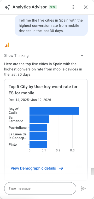
Saves you from navigating through the report menu, adding secondary dimensions and applying manual filters. Doing this by hand involves going to Procurement, filtering by country, adding city secondary dimension and then adding a device category filter. Advisor does this in a few seconds.
Example prompt: «Tell me the 5 cities in Spain with the highest conversion rate from mobile devices in the last 30 days».
Are you able to create segments?
Yes, and it does it very fast, being one of the most interesting uses we have tested so far.
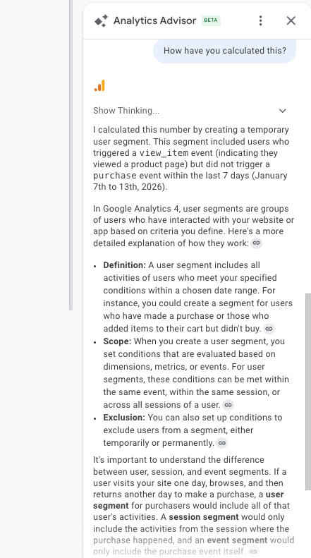
Example Query: “Show me the number of users who have viewed a product page, but have not completed a purchase in the last 7 days.”
TIP: if you want to ensure a correct methodology, you can ask the agent directly how he has made this calculation. In this case, he tells us the following: I calculated this number by creating a temporary user segment. This segment included users who triggered a view_item event (indicating that they viewed a product page), but did not trigger a purchase event in the last 7 days (January 7-13, 2026).
Can you make comparisons that cross metrics and dimensions in the same table, for a specific date?
Although it does manage to pull out the table comparing the conversion rate of the different cities, you have to pay close attention to the issue of dates.
Example prompt: Compare the conversion rate based on sessions in Burgos, Valladolid and Palencia during the last month. Show me the results in a single table.
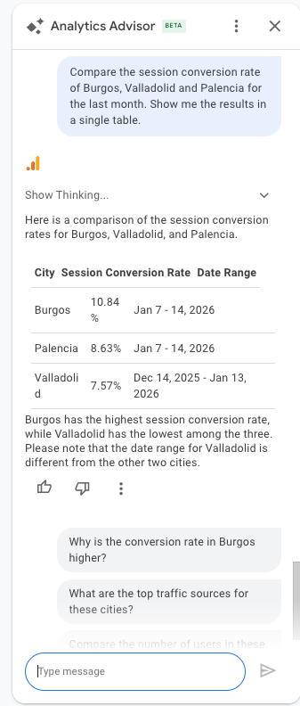
Attention! It is vital to always check the date ranges in the generated tables.. As can be seen in the example, the Advisor mixed different periods for Valladolid versus Burgos and Palencia. An analyst who does not detect this could draw totally erroneous strategic conclusions based on non-comparable data.
Identification of «key drivers» (or key factors)
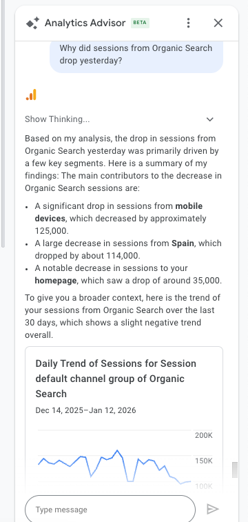
We could say that it is one of the most advanced AI functions. It nimbly analyzes the movements of a metric and the possible causes behind it. The Advisor automatically analyzes which dimensions (pages, cities, browsers) contributed further to this decline. We would need more time to find the exact culprit; the AI does it by instant statistical rule-out.
Example prompt: «Why did sessions from Organic Search drop yesterday?».
Continuing with the example from the previous section (conversion rate by city), let's see what level of detail it provides.
Example prompt: Why is the conversion rate higher in Burgos?
The analysis is quick and the data obtained are very interesting to understand why in this city the conversion rate is higher than in other cities that we have marked as a reference.
In order to be able to make a more accurate analysis, it would be interesting to use the metric “session conversion rate” only based on the purchase, and not on the other events that are marked as key. To do this, we will continue to consult the following:
Example prompt: I want the same analysis, but filtering only by event “purchase”.
This is where it starts to fall short, and we can't continue with the analysis. Since it's unable to calculate the conversion rate based solely on purchases, the insights it provides are related to transaction volume.
That is why it is so interesting again that let's go into the “show thinking” section to understand what barriers and obstacles have been encountered in the process.
(Show thinking from this prompt: “Although I can't filter the conversion rate analysis by a single event, I can perform a similar analysis by looking at the total number of purchase events for each channel and device.”)
On-the-fly trend visualization
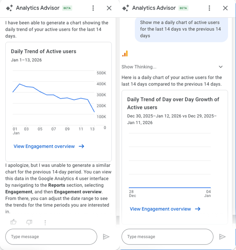
Often, creating a trend chart requires going to the Explorations module. Now this chart can be generated right within the chat, which is ideal for quick «screenshots.» But how well does this feature actually work? Let’s take a look:
Example prompt: “Show me a daily graph of active users over the last 14 days compared to the previous 14 days.”.
Here we can see how the agent fails to return graphs with comparisons. However, he himself admits being unable to do so and proposes to return the graph with a basic timeline, which actually corresponds to the following query: “Show me a daily graph of active users during the last 14 days”.
Current limitations and aspects to be taken into account
Can you use custom channel groups?
Although a priori it tells you it does, and manages to identify them correctly within the property, when cross-referencing metrics with this dimension, errors occur on a recurring basis and finally cannot be used to generate valid reports. The Advisor recognizes the name of the custom channel groups and seems to understand their existence, but fails to integrate them into tables or comparisons along with metrics such as sessions, conversions or revenue.
This limits its usefulness in more advanced acquisition analysis, where such groupings are often key. As it stands, any analysis that relies on custom channel groups still requires recourse to standard reports or Scans, as the wizard does not provide reliable results at this point.
Can you use calculated metrics?
Similar to the previous case, a priori it manages to identify the calculated metrics that are created, they know the exact number of metrics of the property, but when asking for a report with them, it usually asks you to provide the formula that has been entered, so that it is The lack of reading of the metric as such is perceived.
At the end of the day, Google Analytics Advisor can save you a lot of time on quick queries and help you see patterns without getting lost in menus. However, don't rely 100% on everything you get back: check the comparisons, the channel groups and the calculated metrics before making important decisions. It is a useful tool to complement your work, but the analyst's experience and eye remain irreplaceable.