
Having a website nowadays is a must for any company. Whether it is an online store or a corporate website focused on attracting contacts, the ultimate goal is always the same: to convert. Sell, generate leads, receive calls or quotation requests.
In practice, many companies find themselves in the same situation: the website has visits, even quality traffic, but the results do not come. No products are sold, no forms are entered and the general feeling is one of frustration.
Online conversion does not depend on a single factor, is the result of many elements that need to be alignedspeed, user experience, design, content and strategy.
The following is an analysis of the main reasons why your website does not convert, We differentiate between general problems and specific errors depending on the type of web site, and propose concrete solutions.
General reasons why your website does not convert
Slow loading speed
Web speed is one of the most important factorss for conversion. When a user enters a website, he expects everything to load immediately. If they have to wait, even a few seconds too long, the probability of abandonment increases dramatically.
A slow website generates mistrust, conveys an unprofessional image and, in addition, harms the positioning in Google. No matter how good your product or service is: if the page takes a long time to load, the user will not even get to see it.
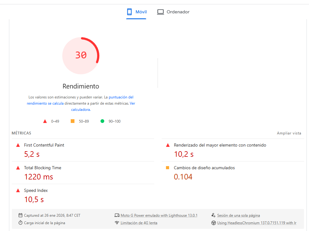
Solution:
Analyze your website with tools such as PageSpeed Insights. Optimize the weight of the images, check your hosting, eliminate unnecessary scripts and avoid plugins that do not add value. These small adjustments often improve speed and conversion significantly.
Poor user experience on mobile
The majority of web traffic today comes from mobile devices, but many sites still do not offer a truly comfortable experience in this environment.
Small text, hard-to-click buttons, unclear menus or awkward forms quickly make the user tired. Y when mobile browsing becomes frustrating, conversion disappears.
Solution:
Test the web from the mobile as if you were a real user. Simplify navigation, increase the size of the buttons and prioritize clarity over aesthetics. A website should be designed mobile-first, not adapted as a later addition.
Confusing design and unintuitive navigation
When someone enters your website, they have to understand in seconds what you offer and what it can do. Menus with too many options, pages without visual hierarchy or long texts without structure generate doubts, and a user who does not know where to go simply abandons.
Solution:
Simplify the structure of your website, highlight the main calls to action and organize the information hierarchically. Each page should lead the user to the objective in a natural way.
Excessive distractions and information saturation
This problem is common, especially on mobile. Floating buttons, banners, pop-ups, icons and too much information competing for attention The user's time is saturated and he/she does not perform any action.

Solution:
Check which elements are really necessary and eliminate everything that does not add value. Fewer distractions and clearer messages usually translate into better results and more conversions.
Reasons why an ecommerce does not convert
Product sheets with little work
The product page is the most important part of an ecommerce. If it is not well designed, the sale is lost. When the user has to research too much to understand what you are buying or what the advantages are over other products, confidence diminishes.
Solution:
Create complete product sheets, with clear descriptions, well-explained benefits and quality images. The key information must be visible effortlessly. At Geotelecom, we are a marketing agency with experience in ecommerce, We know how to structure these pages to maximize conversion.
Long or complicated purchase process
A long checkout, with many steps or long forms, slows down conversion. Each additional field is an opportunity for abandonment.
Solution:
Simplifies the process The checkout process asks only for the essential information and clearly shows at which step the user is at. Reducing friction at the checkout often significantly increases sales.
Lack of trust and social proof
Many users do not buy simply because they do not feel secure. The absence of customer reviews, recognized security seals or clear shipping and returns information generates doubts about whether they will receive what they expect, even if the product or service is excellent.
Solution:
It includes real reviews, customer testimonials and visible security seals. You can visit take advantage of platforms such as Google My Business or Trustpilot to show verified reviews from satisfied customers. Also make sure that information about shipping, returns and warranties is clear and easy to find. These elements convey confidence and greatly increase the chances that the user will complete the purchase.

Reasons why a lead or contact web site does not convert
Unclear or non-existent calls to action
If CTAs are invisible, confusing or do not exist at all, the user does not know what to do. And if you don't know what to do, you do nothing.
Solution:
Work on clear, visible and coherent calls to action with the content. Requesting a specific action and repeating it strategically helps increase conversions.
Poorly designed forms
The form is the last step before conversion, and is often where it all goes wrong. Forms that are too long generate rejection.
Solution:
Find the balance between asking for sufficient information and not saturate to the user. Ask only for what is essential and facilitate the process, which tends to increase lead acquisition.
Message not user-centric
Talking too much about the company and not enough about the customer's problems reduces conversion. Le users want solutions to their needs.s, not read your corporate history.
Solution:
Focus on the benefits to the user and how you can solve their problem. When they identify with your message, they are more likely to convert.
Measurement and analysis: the basis for improved conversion
Finally, there is a key point: measure everything. Without data, it is impossible to know what is really wrong. Reviewing runaway pages, average visit duration, most viewed pages and user journeys allows you to detect problems and opportunities.
Traffic is often directed to informative sections when the objective is transactional., or there are clear abandonment points. Analyzing this data and making decisions based on it is essential.
At Geotelecom, we use these metrics to implement effective improvements that increase conversion. In addition, we have a team of experts who can help you to design a customized marketing plan for your company and its objectives, optimizing lead acquisition, online sales and the performance of your entire website.


